Glance Sans @ Nordfjord Opera House Visual Identity
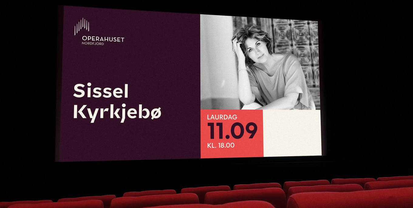
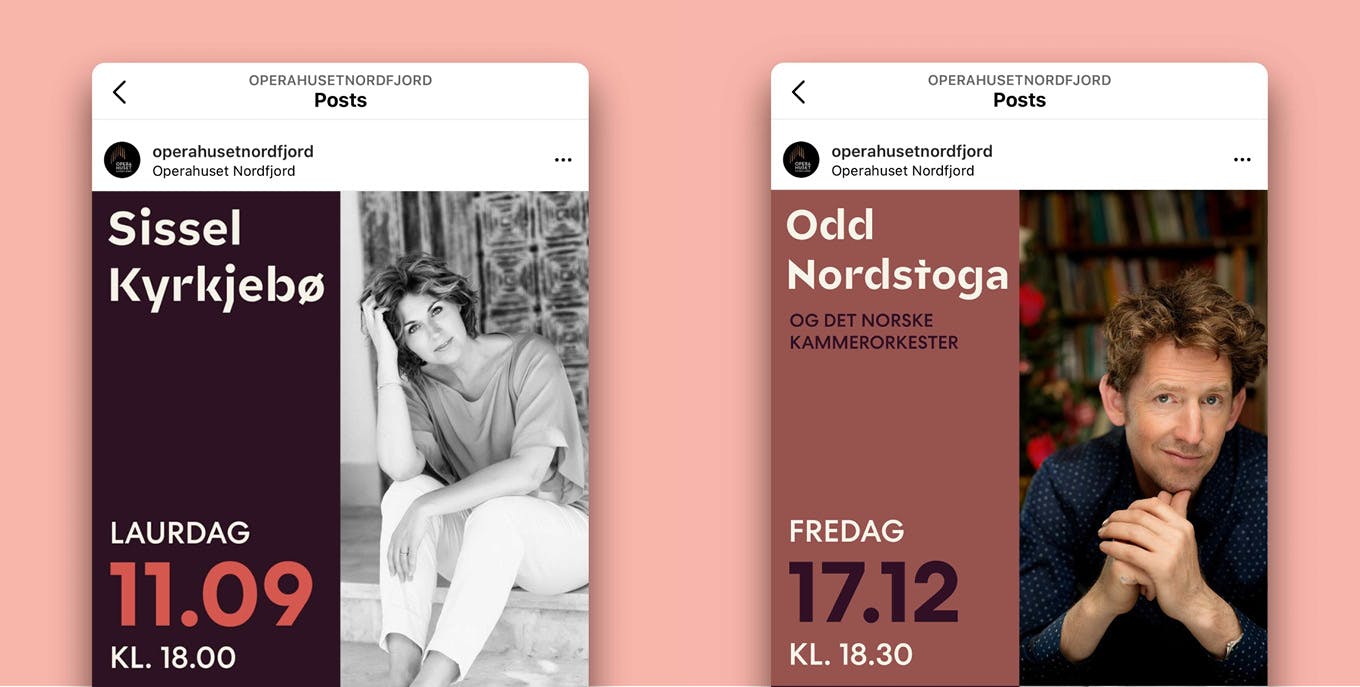
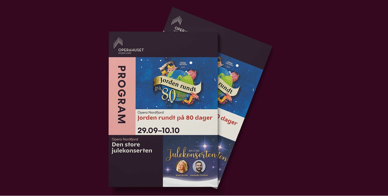
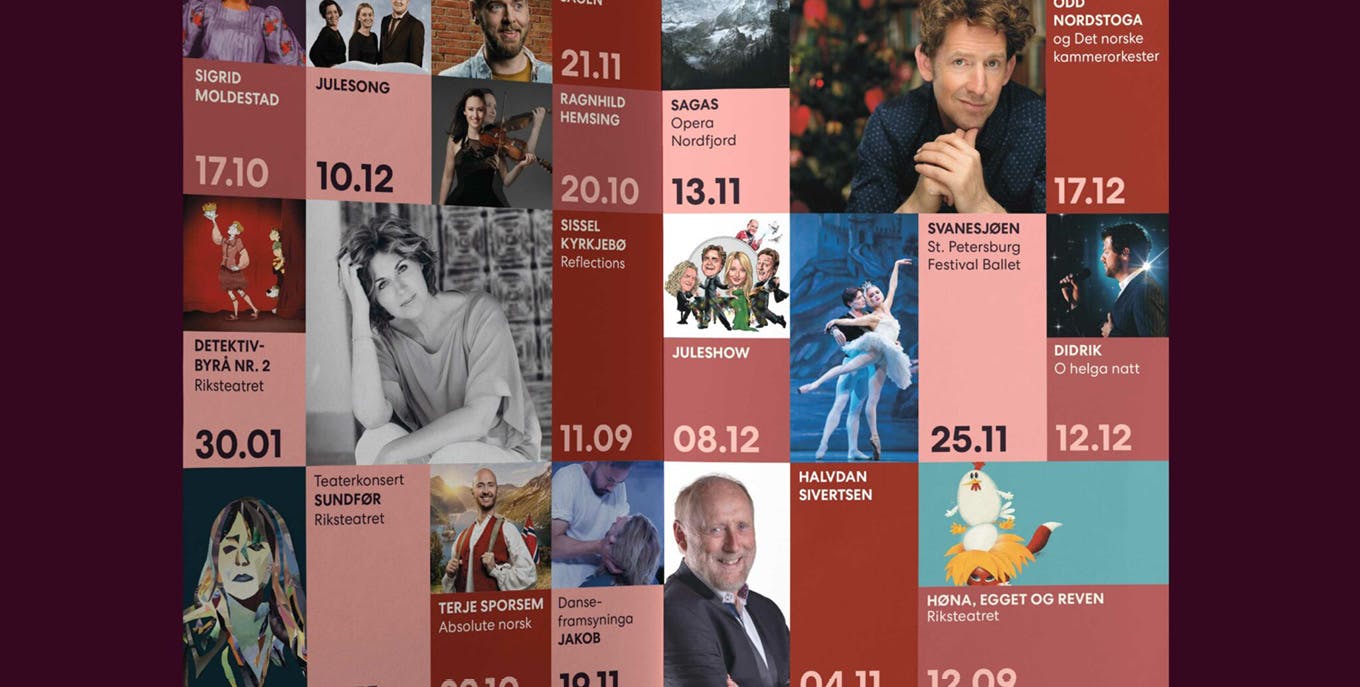
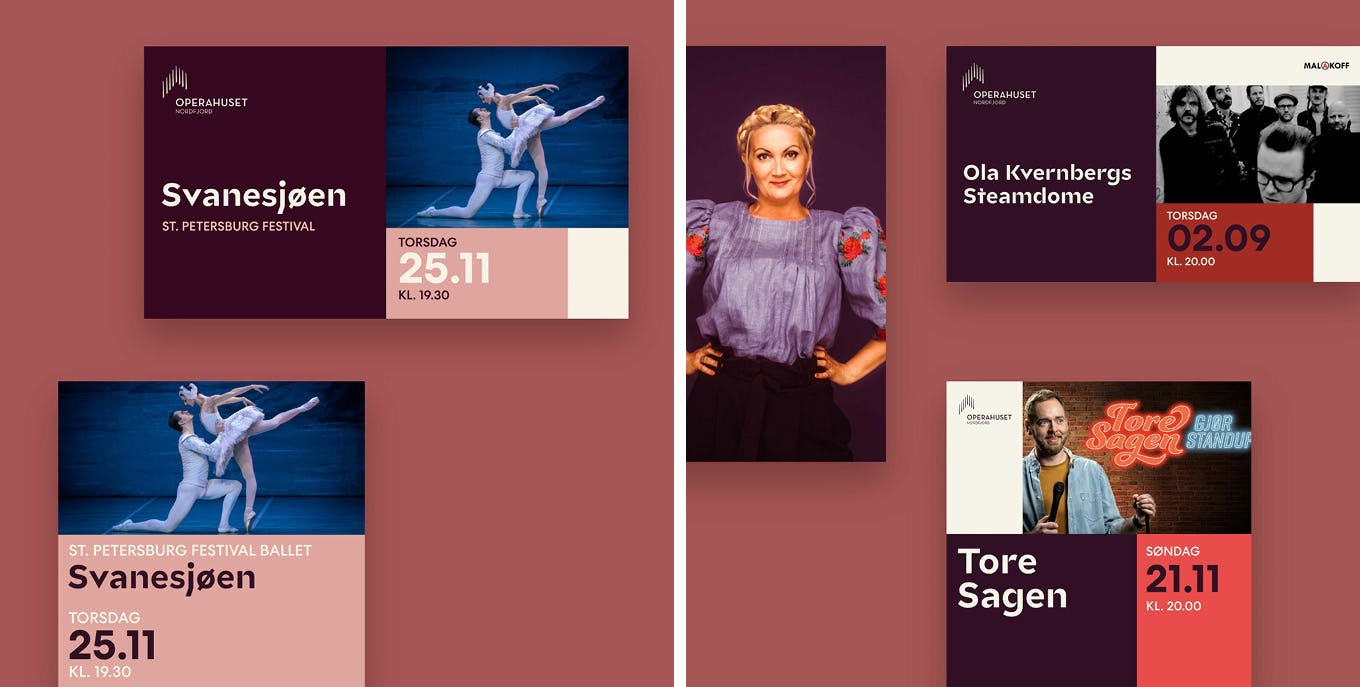
Operahuset Nordfjord is a cultural hub in western Norway that accommodates a wide variety of concerts, operas and shows. Blåmyra developed a design system based on columns and rows. The 8 pillars in the logo are translated into 8 columns, and the rows are constructed from the 5 lines found in sheet music. Through this system, modules are constructed as building blocks for each individual format: from individual events on social media to flyers and banners.
Glance Sans was chosen for its visual details mirroring the diagonal lines found in the logo. The color palette is derived from the building’s color coding: the orange stage carpet, the red doors and the characteristic light installation on the outside of the building. In some applications, Glance Sans is paired with other typefaces, such as Centra No.2 by Sharp Type.