Le Romain du Roi
When would you say the first corporate typeface was designed? Take a bold guess.
Going back in time, the first corporate typeface in history had already been commissioned in 1692 by the French King Louis XIV. He ordered the design of a typeface, which was solely intended for the use within the royal printing house.
The printing house was responsible for printing the King’s notices and publications. For that reason – in my eyes – the Romain du Roi is the first Custom Corporate Typeface. The typeface represented Louis XIV, who spoke to the people through the printed statements. The french name Romain du Roi means translated “King’s Typeface”, or strictly speaking “Antiqua of the King”.
Was your guess close?
About King Louis XIV.
Who was the King who invented the concept of a custom corporate typeface? Let’s take a closer look!
King Louis XIV (1638 – 1715) was appointed king at the age of four after the death of his father, but he did not take power until he was 23 in 1661. Humbly, he gave himself the title of Sun King as the sun is the center of the universe, just as he, the king, symbolized the center of the country. Under his reign, Louis XIV led France out of the Middle Ages and paved the way to modern times. He built palaces (including the Palace of Versailles), fortresses, monuments and founded academies that promoted science and art. To develop the economy, he introduced the division of work processes so that in manufactories, the forerunners of factories, mass production of goods could now begin. This led to financial gains through tax revenues, but his striving for power finally brought France to a financial ruin, as he invested money fighting numerous wars as well as magnificent but costly buildings.1
The Origin of the Romain du Roi
Besides the fact that the Romain du Roi is the first custom corporate typeface, its design is also of particular historical importance. It represents a significant development in the evolution of typefaces: The Romain du Roi is considered the first transitional Antiqua, which „acts as a link between the Renaissance Antiqua influenced by writing and carefully planned and thought-out) forms of later classes“.2
Louis XIV was particularly interested in art and had already set up a group, the Bignon Commission, whose task was to produce illustrated books on the arts, crafts and trade. The committee began its research by studying the craft that they considered most important, the printing trade. So it was not surprising that Louis XIV entrusted the Bignon Commission, made up of Abbot Bignon (clergyman, writer and librarian), Jacques Jaugeon (royal typographer), Gilles Filleau des Billettes (scholar) and Father Sébastien Truchet (priest) with the task of designing his royal typeface.
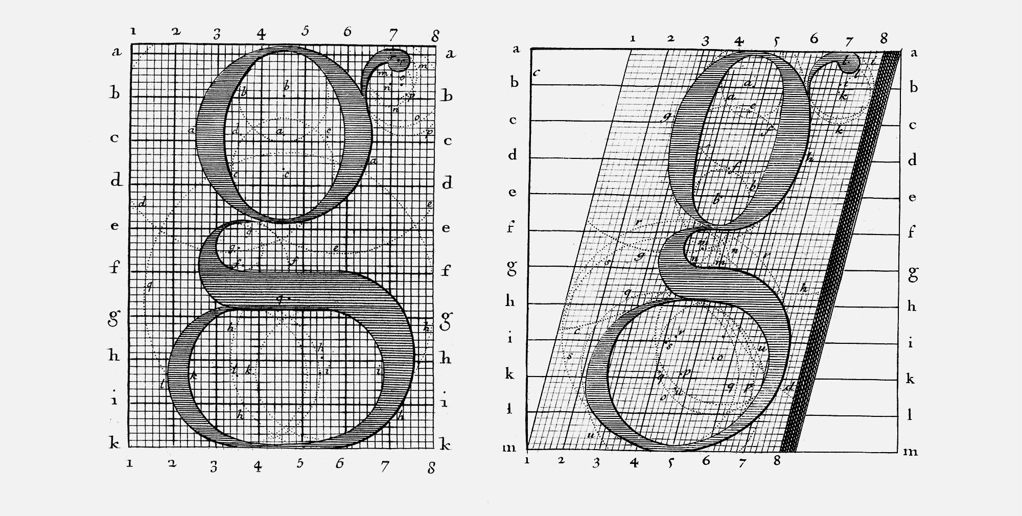
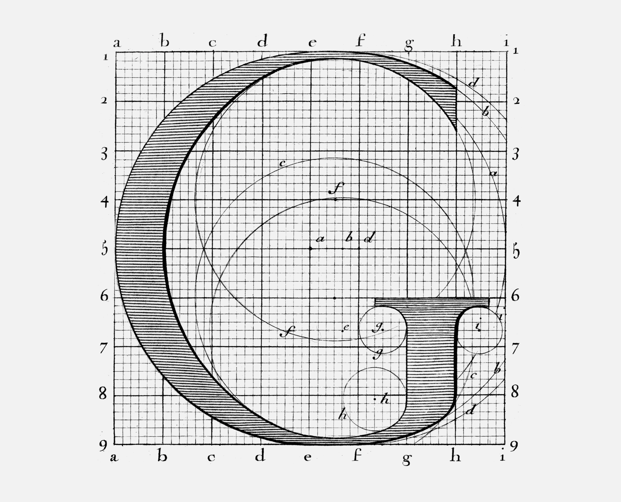
The commission developed a grid for the letters, consisting of 8 × 8 squares for the capital letters and 15 × 8 squares for the lowercase letters. These individual squares in turn consisted of 6 × 6 squares, so that the grid of an uppercase letter consisted of 2304 small squares in total. Within this grid, the typeface was designed and later scratched into copper plates by engraver Louis Simonneau. The punch cutter Philippe Grandjean, who was working as a royal punch cutter at the time, finally completed the typeface by making stamps from the originals. His final letters were understandably slightly altered in comparison to the hand-drawn designs.
Special features in the design
As already mentioned, the Romain du Roi was the first transitional Antiqua. It laid the foundation for the development of the classicist Antiqua, whose most famous representatives include Bodoni, Didot and Walbaum. Typefaces of the age of Classicism are more rational and geometric than those of the Renaissance (compared to typefaces by Garamont, Granjon or Van den Keere), which were characterized being more calligraphic.
The Romain du Roi was the first typeface to be designed on the basis of a mathematical grid. The underlying grid resulted in perfectly straight stems, as well as perfectly horizontal serifs on the baselines. Another consequence of the grid was that the ascenders of the lowercase letters ended at the height of the uppercase letters. In the typefaces designed before the Romain du Roi, the ascenders slightly exceeded the uppercase letters.
The Antiqua
Both the geometry and the symmetry are particularly evident in the design of the bowls of the letters /b, /d, /p and /q. These elements are clearly not derived from writing with a broad nib as they are symmetrical. For the first time in its history, the minuscule /b was given a proper foot serif on the left side, before that, the /b often only had a small spur.3 The ascenders of the lowercase letters as well as the /i and /j were given a head serif on both sides, but this was dispensed with during the later development of the classicist Antiqua. These particular elements are therefore an important distinguishing features of the Romain du Roi.
The lowercase letter /l shows the most distinctive feature of the letters. It has a small serif on the left side at x-height, called ergot or sécante in French. The serif is a remnant of the calligraphic style which had not appeared in any previous typefaces. This serif makes the Romain du Roi unique.
The reason why the Romain du Roi /l possessed the serif is not clearly documented. One theory says that this serif was used to distinguish it more clearly from the capital letter /l, which has the same height. The other theory claims that Louis XIV wanted to have an unmistakable feature in the /l, because his name began with this letter. I personally find the latter theory more charming, but rationally speaking the former sounds more reasonable. Whatever theory may be true, the serif is THE identifying mark of the Romain du Roi.
The Italic
The Venetian, Aldus Manutius, first printed a book exclusively in italics around 1501. The italic type allowed more text to be used on one page, which led to cheaper and more portable books that were now accessible to a larger population. The books of Aldus Manutius were the so-called Aldinen, a forerunner of today’s paperback.4
At that time, upright and italic type were usually used separately, which is also reflected in the design. The italic typeface is clearly derived from handwriting, so compared to the Antiqua, these are two independent typefaces and designs. Originating in Venice, Italy, cursive typefaces are today known as Italic. The italic of Romain du Roi, on the other hand, are an inclined version of Antiqua. Again, the grid, this time inclined, served as the basis for the design, so that the letterforms are very similar.
The use of the italic is also special, as it was used together with the Antiqua. The combination of upright and italic is common today, but in the times of Louis XIV, this was rather unusual.
The innovation in the letterforms of the italic version of Romain du Roi is the lowercase letter /h.5 Until then, the serif of the second stem led into the counter of the letter, so that in small point sizes it could easily be mistaken for a /b. The Bignon Commission however, designed this serif outwards, just like it is on all other letters. From now on, this design became the standard version of the italic /h.
Use of the Romain du Roi
The Romain du Roi was first used in the book Médailles sur les principaux événements du règne de Ludwig le Grand in 1702. This book listed the achievements of King Louis XIV. He awarded himself medals for almost every event, including the fact that he recovered from an illness.
Shortly after the publication of the book, many designers began to imitate the style of Romain du Roi, but they often refrained from using the serifs on the /l and the head serifs on both sides.
Completed in 1745, long after the death of Philippe Grandjean in 1714, the final typeface had 82 different weights, 41 upright and 41 italics.
According to the legend, Louis XIV strictly prohibited the use of the typeface outside the royal printing house, which is understandable from today’s perspective given its status as a corporate typeface. But it was not until 1814, much later than assumed, that the use of the typeface outside the royal printing house was formally prohibited. During the revolution, the British used the typeface in fake posters to destabilize the French regime.
Until 1816, the Romain du Roi was the font of the French king, until it was finally replaced by a Didot-style typeface.
Evaluation of the Romain du Roi as a King’s Typeface
How does the Romain du Roi represent the King? Is it a suitable corporate typeface? The most distinctive detail of the typeface, the serif at the /l, clearly marks the typeface as the belonging to the King. This letter, which is actually very simple in design, has become a real distinguishing feature with its serif at x-height. Every French citizen could immediately tell from this letter that it was a printed document from the King. Recognition being one of the most important tasks of a corporate typeface was thereby established very easy.
Compared to the typefaces commonly used at the time, the Roman du Roi has a higher contrast in stroke width, which nowadays makes the typeface appear noble and elegant - attributes that a King might traditionally be associated with.
Type design was taken into a new era by the Romain du Roi, moving away from organic to rational design. Thus, the typeface has been innovative and forward-looking. Likewise, under Louis XIV, France was developed from an agricultural to an industrial society. Thus, certain parallels can be observed between the reign of the king and his typeface.
What if the Romain du Roi had not been a royal typeface?
Many printers copied the style of Romain du Roi. Fournier le Jeune, for example, was one of the typographers who adapted and developed the style of the Romain du Roi.6 Accordingly, the typeface was visually represented throughout the country. The Italian Bodoni, the King of Printers, studied Fournier’s work, among others, which finally led him to his typeface, which is the culmination of the classicist antiqua.
The evolution of letters and typeface design might have taken a different course if the Romain du Roi had not been a royal typeface but one from a normal punch cutter. Would the style have been adapted throughout the country?
Next Chapter: Various Types of a Corporate Typeface
- vgl. https://www.planet-wissen.de/geschichte/persoenlichkeiten/ludwig_der_vierzehnte_der_sonnenkoenig/index.html
- https://de.wikipedia.org/wiki/Barock-Antiqua
- vgl. S. 58, Letters of Credit: A View of Type Design, Water Tracy, David R Godine, 2003
- https://ilovetypography.com/2014/11/25/notes-first-italic/
- vgl. S. 59, Letters of Credit: A View of Type Design, Water Tracy, David R Godine, 2003
- vgl. Seite 175 und 199, Anatomy of a Typeface. Alexander S. Lawson. David R. Godine Publisher, 1990
main source:http://origin.myfonts.com/s/aw/original/46/0/23804.pdf