Get to know Moritz Kleinsorge

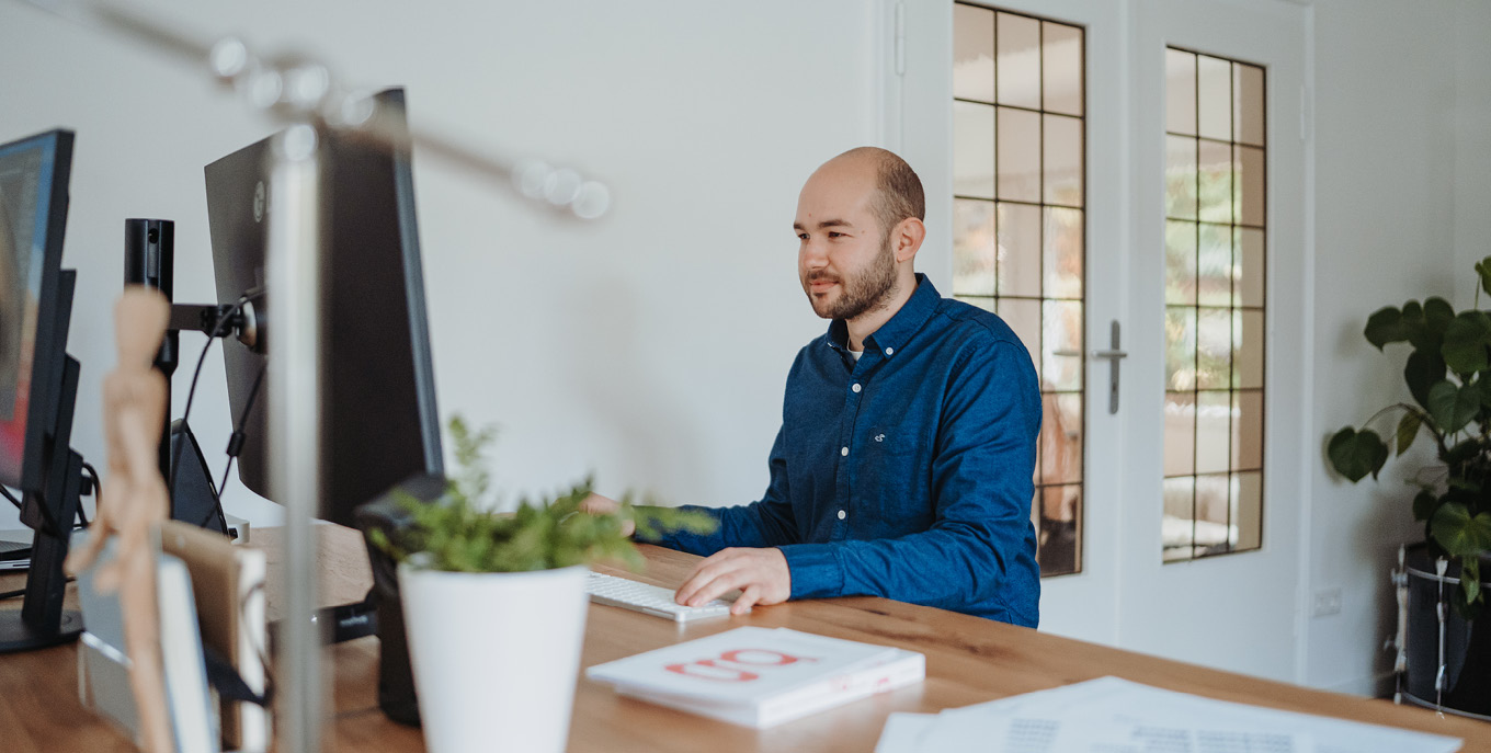
The new office is set up, the fotoshooting is done. So I thought it would be good for you to get to know me better. I asked my friend and colleague Julien Fincker to interview me, he already did that once some time ago for a German (online) design blog, focussing on my master thesis. If you are German or at least can read it, it’s still online, find it here
Here we go.
First things first: Why do you think Borussia Mönchengladbach is the best club in the world? (Editor's note: it is not)
Why do you limit this question to the world and not the universe? Borussia Mönchengladbach has a great history and is a familial club with heart and soul. And it's the closest Bundesliga club to my hometown, which is probably why it's the best club in the universe.
Could you help them more with your soccer skills or with a custom font?
Until I was 18 years young, I was quite a good footballer. I had a good feel for the ball and a strong left foot. The feeling for the ball is still there sometimes, very irregularly, but the physical stamina is gone. But tennis has been my sport since I was 16. The rallies are quite short, but the sprints are all the more intense, and thanks to the many breaks in games, I can manage.
So, today I could help Borussia much better with my skills as a type designer. They are currently using Bungee by DJR as their main font. The typeface fits more or less. The design – for my personal taste – is a bit too static and squarish, although it has the typical US Sports font vibe. The name itself fits with the inconsistent performances of the club within the last few years. In general I think I could come up with a more suitable font. Borussia stands for attractive, offensive football. A very dynamic font with certain playful elements would certainly be more suitable.
You launched your foundry Identity Letters two years ago. How did it come about?
In 2019 I had just finished my masters in communication design and I asked myself the following question: Should I work for a design agency and become a graphic designer or should I continue what I had been loving to do for the past three years alongside my studies? Even while writing and designing my master thesis, a project that I was excited about, I struggled with time, because I could not stop myself from designing typefaces in parallel. My mind and my heart was set on type design, so I created my own foundry and webshop. I was very excited for its launch in 2020.
Where does the name Identity Letters come from?
You know first hand that one of the hardest parts in type design is to find a proper name for your typeface, so I thought finding a name for my own type foundry was even harder. But luckily, my master thesis set the basis for the name. My topic was “Custom Corporate Typefaces of German Companies”. I wrote about the theory behind creating a custom corporate typeface and analysed existing custom corporate typefaces of German companies. I felt that my foundry should build on this work and continue to evolve in that direction. I ended up with the name Identity Letters: the word Letter can stand for a glyph itself but also for the written letter, symbolising the communication between a company and a client.

How did you discover your passion for type design?
I started my design career as a web designer, but the lifetime of websites were quite short around 2012. There were constantly new technical developments that made all my designs outdate very fast. This fact became frustrating for me. A bit after this realisation, my typography professor Prof. Dr. Jörg Petri showed us commonly used typefaces within a book. Within this list of many serif typefaces I noticed that some of them were designed around 1500 and are still used today. This was mind blowing to me. This had been exactly what I was looking for, although I don’t think my typefaces will still be used in 500 years.
And now being a type designer, I've noticed a curious family connection. My father was a journalist and my grandfather (father's side) was a draftsman. I did not get to know both very well, but somehow I am connecting both of their jobs.
Most of your family members are teachers. What subject would you teach if you had not become a designer?
Yes, I am a teacher's kid. And my sister also became a teacher. Both of my aunts are teachers. We do have a lot of teachers in the family (mother’s side). If I had become a teacher, my subjects would have been sports and (historical) geography I guess. These were the only subjects I really liked in school, next to Latin. I could also imagine teaching Spanish or Italian while we are talking. What you might wonder about, I didn’t enjoy Arts that much, basically because I am a bad drawer.
Would you like to teach graphic or type design one day?
Spreading knowledge is important to me. This year I mentored some type design beginners. But if we are talking about teaching at university, I am not quite sure. I was thinking about teaching jobs about three years ago, but the first time I aimed for one, it didn’t work out. Since then, I have had at least two opportunities to teach, but both times I rejected. Sometimes I think I am more the one working silently in the background and leaving the shiny spotlight to others.
But I still like to share my knowledge, so I aimed to publish my master thesis with a publisher. Unfortunately they thought the topic was too detailed and at the same time I dealt with confidential information in the book, so a publication would have probably ended with legal problems. So I decided to share the first non-confidential part of my master thesis on my blog. [see “Corporate Typefaces (theory)” within the blog.]
Is there a type genre you would like to specialize in?
I would like to start working on custom fonts more often. In 2022 I created two custom fonts and made some small modifications to my retail typefaces. As the founder of Identity Letters I am allowed to say that there is nothing better for a brand than owning a custom corporate typeface. While more and more brands look quite similar, this is your way to stand out from the crowd.
What other genre would you be interested in that is not yet in your portfolio?
I want to start learning how to design a cyrillic and greek typeface. I want to add these scripts to the library as well. I haven’t created a monospaced or stencil typeface yet, so I am excited to try out new things in the next couple of years.

And what will we probably never see from you?
Never say never, but I probably won’t ever create a handwritten font. Hopefully someday other type designers will submit handwritten/brush typefaces to release it at Identity Letters, but I by myself won’t start to design one ever.
Type design is a very lonely activity. Do you need it that way or what do you do in order not to lose your social contacts?
Designing a typeface is a lonely activity for sure, but I don’t mind that. My girlfriend is sitting in front of me at her desk, so I am not alone in the office. Next to that, I am in virtual contact with other type designers [see meet the team] via a Slack group. We chat every day, so I stay in contact all the time.
Besides that, I do have a life outside the office, although it sometimes comes short, as I love to work a lot. But I am part of a tennis team. And my family bond is quite strong, we see each other twice a week. I don’t feel alone, although a cat sitting on my legs while I design a typeface sounds nice (but just during winter, during summer I am unbearable when it gets hot).
How many typefaces do you usually work on in parallel?
Actually, there aren’t as many as you would think right now. Most of the time I am working on two typefaces, with one in full focus. Right now I'm finishing Flink Neue and for the perspective of what comes after, I need to have another typeface that has a solid foundation I can work on once Flink Neue is released. There are some sketches on the hard drive that might show up in Glyphs someday again, but I am not enthusiastic about them right now. There is always the fear of having nothing once a typeface is done and released. But for almost ten years, I always had something on my desktop.
What is your workflow like?
If you would call that a workflow, mine would probably be a very inefficient one. Normally I start with an idea I had in mind, or I have seen something that inspires me. Then I start by doing a quick sketch, either completely rough by hand or directly in Glyphs. For the design process itself, I start with designing a few lowercase letters. After that I am often very enthusiastic and design the complete basic character set, without noticing that I should have changed some key details before. Just today I widened the apex of a typeface, which I considered to be almost final. Something like that means that I have to edit one detail on 20 glyphs in two or three masters. Once the Roman is final, I start to design the italics. There I also always spot some tiny irregularities, like a wrong overshot or a too narrow/wide stem.
Which part of the creation process do you like most?
The very early stages are the most fun part. There you set the foundation for all details, which are going to be the DNA for the new typeface. It’s a back and forth, a lot of experimenting with shapes, feedback and chats with friends/colleagues. On the other hand, this is also the time when you sometimes have to eliminate an idea or recognize that a typeface doesn't work. This period is always quite lively and entertaining. Once all is set, it becomes more of a routine.
Which designers do you admire?
During my studies I was a huge fan of A2/SW/HK and their type foundry A2 Type. I really liked their philosophy of creating a custom font for every graphic design project they were working on. Something like this was my plan back then before I went full time on type design. Right after going fulltime I started to like Hannes von Döhren and Rene Bieder as they have no formal education in type design. They showed me that it is possible to become a successful type designer without having a masters degree in type design from The Hague or Reading. And of course, their typefaces are also brilliant. Brandon Grotesque by HvD was the first typeface I had a spot on.
Let's specify that again. Is there also a special designer from the South German region with French roots, who you maybe admire even more?
Mmh, I can remember that I asked someone in the south to release his Bodoni/Didone typeface at Identity Letters. He refused, but I think you recognise that there seems to be a very special connection to him. Do I have the chance maybe today? Allrounder Didone. Come on. Your Chance.
I said no! Okay, last question. What plans do you have for the future?
I want this Allroudner Didone. But okay… I want Identity Letters to continue to grow, in parallel with me. I have many plans for the future, I hope that at least some of them will work out. Someday I want to host an intern or even hire a second designer. I want to widen my collaborations with other type designers and I always had the dream of getting an award from the Type Directors Club New York (tdc). Someday I will submit a typeface.