Celebrating Allrounder with free merch for you
I’m proud to announce that our flagship font collection, the Allrounder superfamily, has been updated generously over the past months. I’ve invested lots of love (and sweat) to rethink, renew and refine all existing family members and to add a few new ones.
That’s why I decided to celebrate this relaunch (and the upcoming new family releases) with a special edition of prints. These are the first-ever pieces of Identity Letters merch. You can probably tell I’m excited about them. Each purchase of one complete Allrounder family* or more will entitle you to a free set of these. And did I mention I’ll treat you to free worldwide shipping, too? It’s a limited print run though, so that offer is valid while supplies last.
Eco-friendly prints
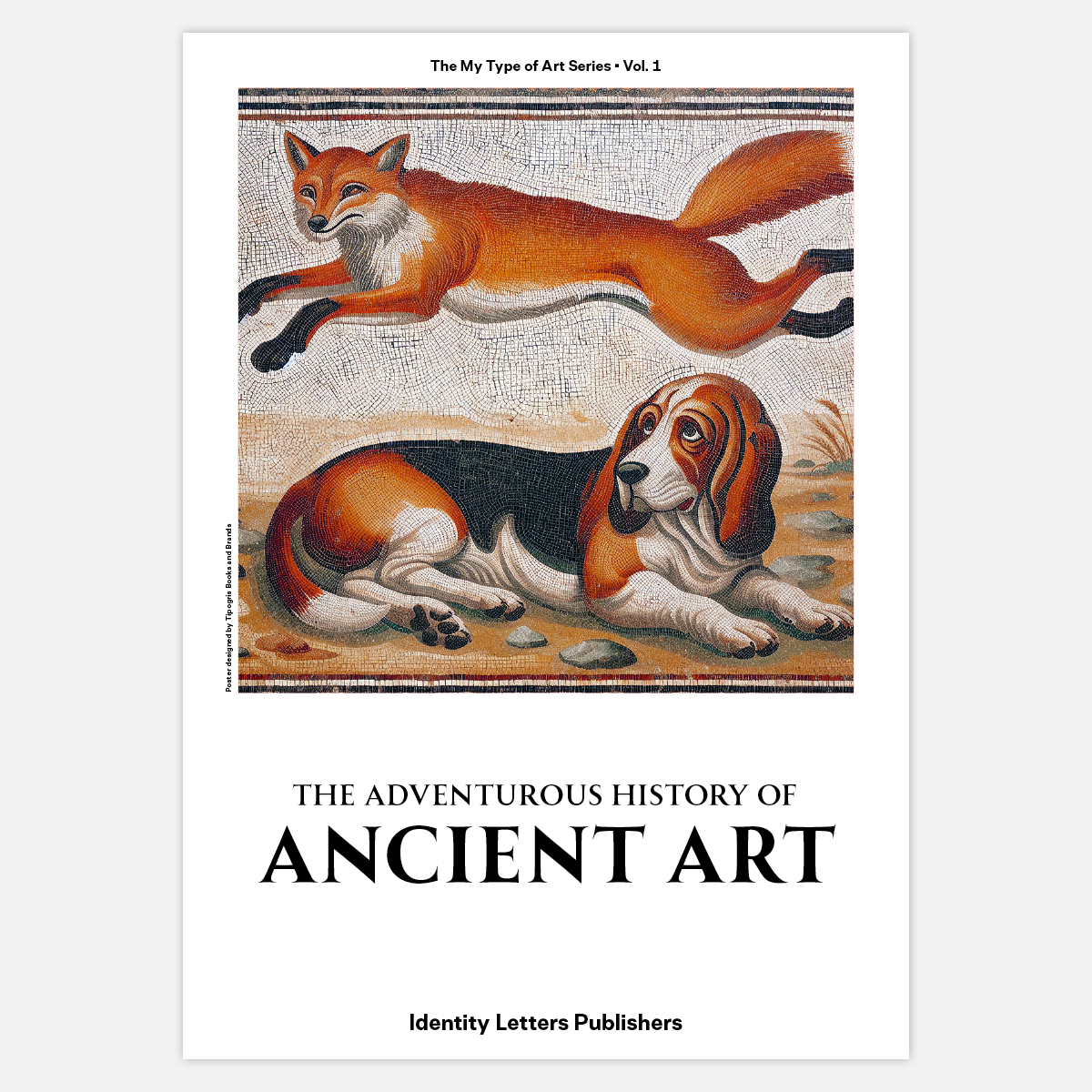
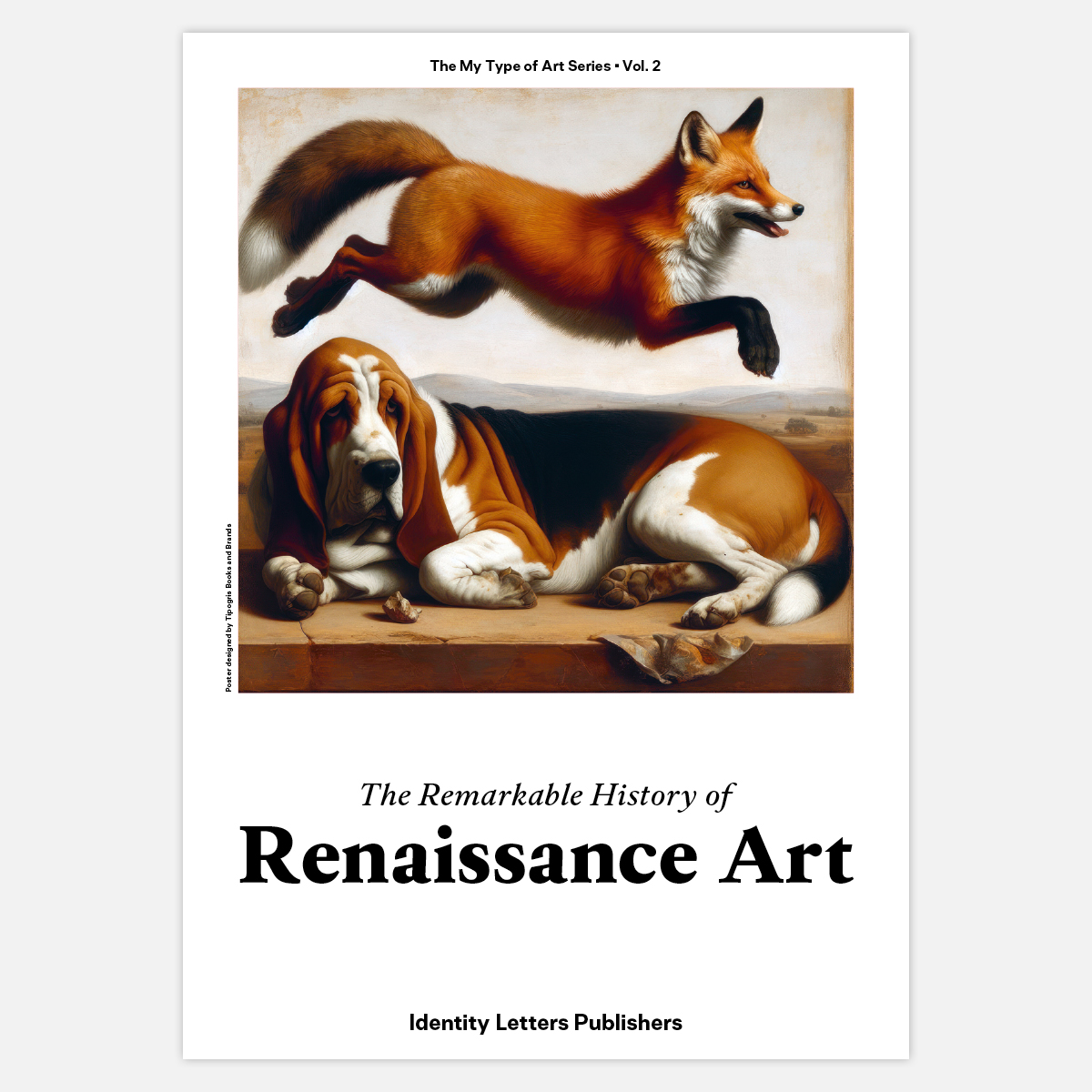
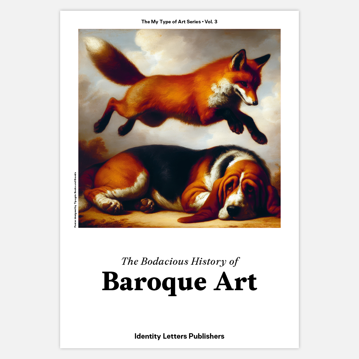
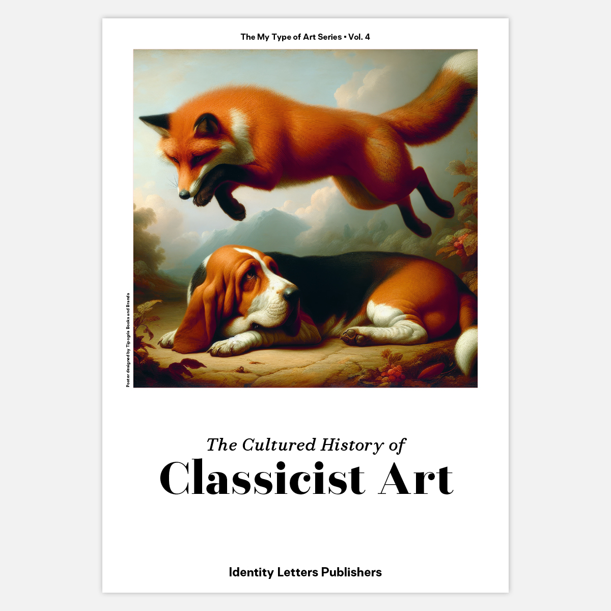
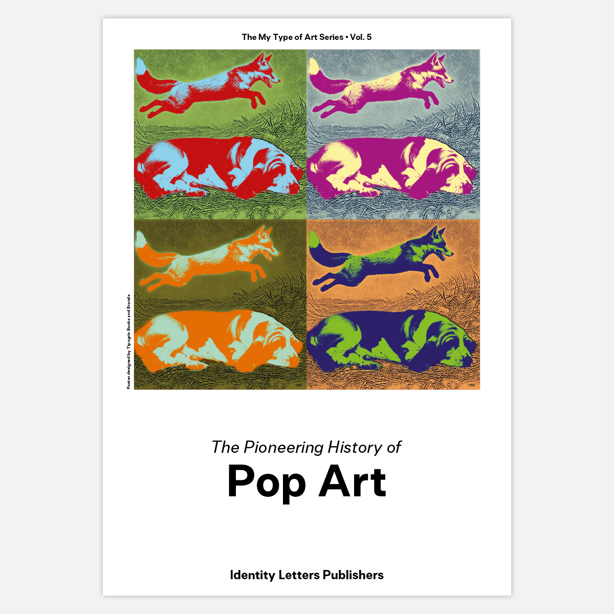
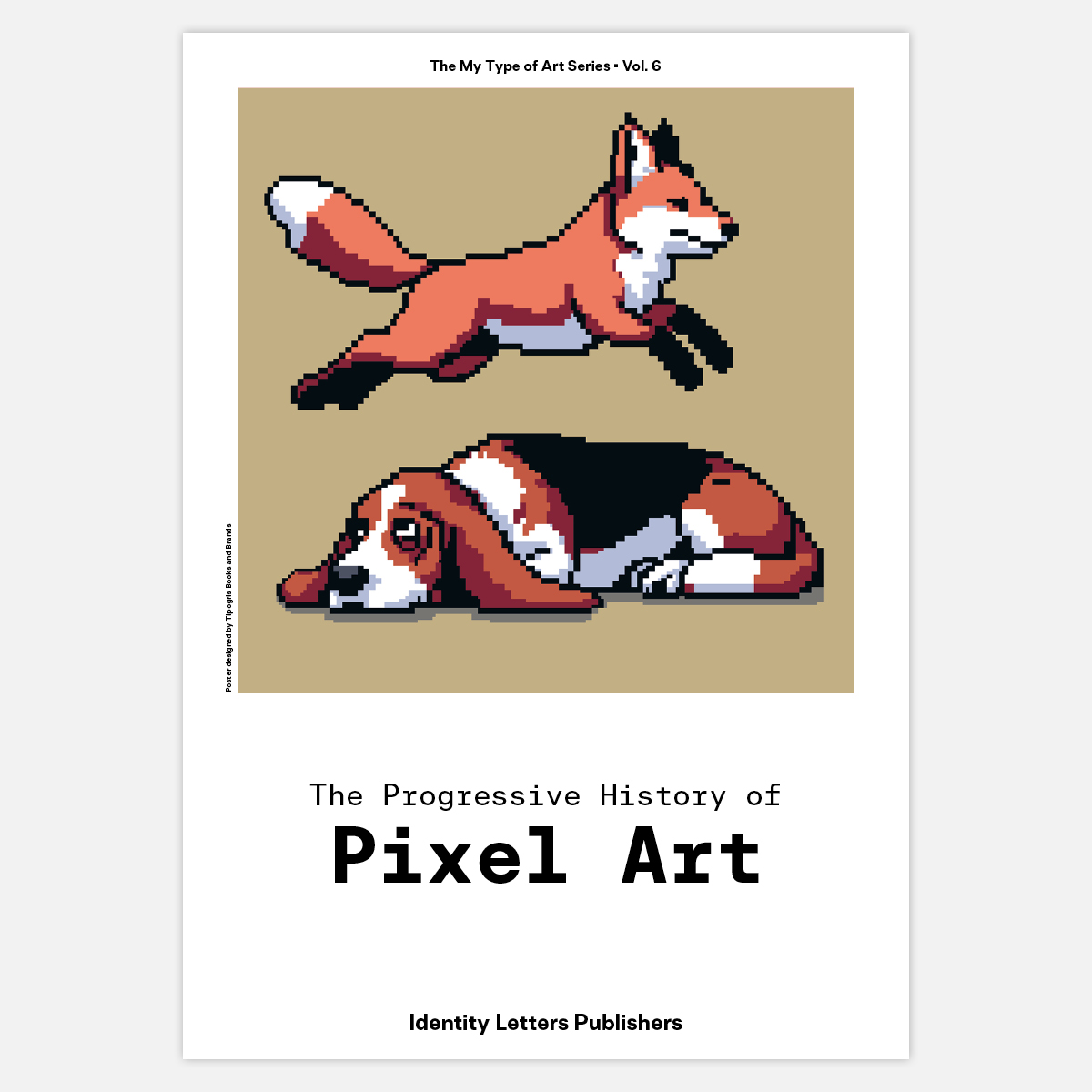
The series consists of six prints, each one a cover for our fictitious art book series, “Just My Type of Art”. Printed on 160g fine paper stock in DIN A4 size, they have been produced climate-neutrally—with vegan pigment ink, free of mineral oil, on sustainably produced paper and with eco-certified production methods.
What was that about art?
Each Allrounder typeface ties to a different epoch in art history, being a contemporary interpretation of historical models that were popular during different time periods. In that regard, you can compare typefaces to art styles. Just like a few individual punchcutters or type designers created seminal works that influenced entire eras of typography, there were a bunch of exceptional painters in each art epoch whose styles came to be regarded as representative for their time: the classics.
Bringing art and typography together, we commissioned our friends at Tipogris with the creation of the series. Let’s hear about the process from creative director, Johannes, himself:
AI-powered masterpieces for the history books
"Moritz approached me with the question whether it would be possible to create one poster related to each Allrounder art epoch that is also somehow connected to type design—and to have a consistent sequence in the end.
Since I’m specialized in book design, creating covers for mock nonfiction books about the different epochs seemed like a no-brainer. But how to link fine art and type design in such a context? Sure, each Allrounder font gets to shine on its respective book cover. But for the image part, just reproducing public-domain masterpieces seemed a little trite to both of us.
As it so often does these days, the solution lay in AI. With language always having been one of my main tools, AI prompting had quickly become a favorite skill for me upon the emergence of AI imaging tools. I was eager to put that to good use here.”
Ancient Roman quick brown foxes and Renaissance lazy dogs
“Type is an abstract means of communication, but there is one famous image that everyone who has ever taken a look at fonts is familiar with. I’m talking about the quick brown fox that jumps over the lazy dog, the world’s most popular pangram—at home in uncounted type testers. Imagine ancient roman painters or mosaic artists giving this trope a try. Imagine Renaissance prodigies immortalizing this iconic pair al fresco. So, I just had to demand a rendition of A Quick Brown Fox Jumps Over the Lazy Dog in the style of a Renaissance (Baroque/Classicist/etc.) painting and the rest was history. Easy, right?”
Prompt-hacking DALL•E
“Turns out, it wasn’t quite as easy as that. But it was history that came into play now. None of the current AI engines were capable of serving a painting from a specific epoch. Even the capability of imitating most historic artists was underwhelming. If something’s not pop culture (yes, looking at you, Van Gogh), the machine just didn’t seem to have been trained on it. Which is kind of weird, considering the Open Source status of these masterpieces. May be it’s also that there are simply not enough different of those masterpieces to train an AI on—to put things into perspective: There are hundreds of millions of generic Instagram selfies, while the number of paintings created in the Netherlands during Renaissance times is probably much closer to a few thousand (a fraction of which has been digitized).
The next step was to resort to old-fashioned books. Real books with real analyses of said masterpieces and nice double-spread pictures. Picking one or two artists from each epoch, I tried to describe the style in bullet point lists and as AI-friendly as possible. This was the time to leave all art history jargon behind and focus on tags that a generic intelligence might understand. I then fed these descriptions into the prompt field, repeatedly—zeroing in on something that could pass as a period piece (to a layperson, at least). This experiment, performed in early 2024, revealed that only Dall•E was remotely capable of accomplishing this specific task, with the overpolished surfaces of Midjourney and and the underinformed image stock of Firefly failing gloriously.”
Modernists wouldn’t have liked Pop Art
“In the end, we were bound to top the whole thing off with fair amount of Photoshop. The generated images we a compromise in many regards, with Baroque and Classicism being too similar upon honest inspection. Also, the entire Pop Art issue felt a bit like cheating because the art equivalent of the Swiss International Style was Abstract Expressionism, not Pop Art. But forcing Jackson Pollock-style splatters into the shapes of dogs and foxes seemed just too cheesy to try. Pixel art had to be handpixeled entirely since the AI doesn’t really grasp the concept of pixels other than in a superficially aesthetic way. Other things went surprisingly smooth, such as the depiction of an anachronistic Basset hound in a Pompeian mosaique. Mash-ups like these are what AI image generator excel at in 2024 and they are also what still fascinates me most about them.
As a nod to Dall•E, we eventually kept the square image format for the final covers. What is it with Dall•E’s incompetence of image proportions, anyway? We ended up with a book series that I, for one, would love to have on my shelf (if I may judge these books by their covers). I hope many others would, too!”
Get your free set
The six prints look brilliant as a framed series. If you would like them at your own wall, head over to the Allrounder family page and choose any family package.* Your billing address will be used as your shipping address, too. If you want your prints to be shipped somewhere else, write me!
*does not apply to Allrounder Monument